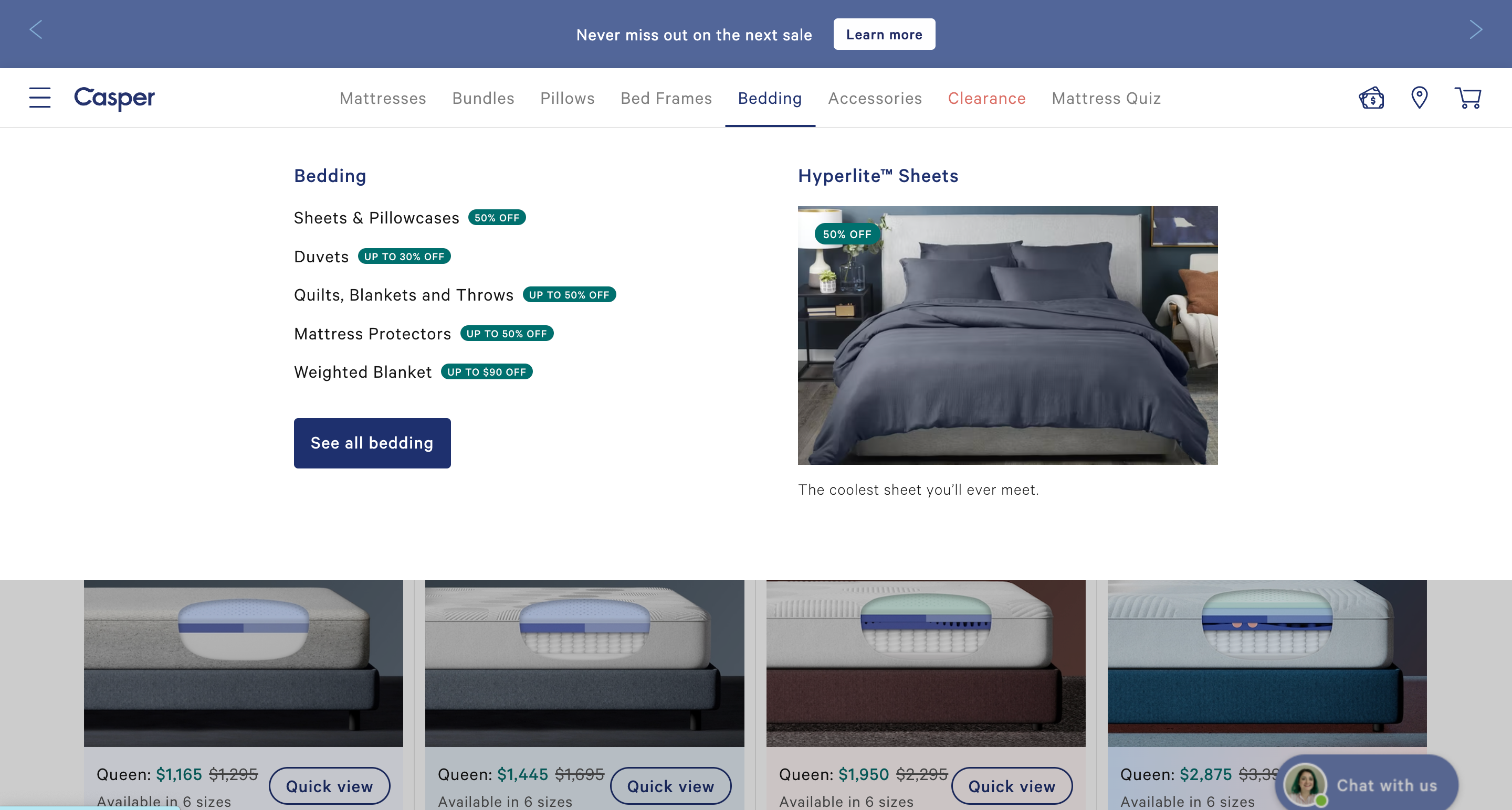
eCommerce Website Design Best Practices & Examples – Forbes Advisor

Creating the optimal e-commerce website design and user experience (UX) can be challenging. Great UX combines multiple design choices for the website’s information architecture, site-wide navigation and individual page layouts. Each decision can change the odds of making a sale—in one way or another.
Because of the razor-thin profit margins, e-commerce companies can’t afford to make poor design choices. Learn what design best practices other retailers use to succeed with this list of e-commerce website design examples.
1. Use Hero Product Photos on Home Page
Cricut
Crisp, high-definition product images on the home page instantly capture consumers’ attention. Since our brain processes visual information faster than written texts, hero product shots also help new visitors understand your main value proposition and get excited about your offerings.
Even more curiously, Baymard Institute found that shoppers are more forgiving of technical glitches in e-commerce website performance when it features vibrant imagery. You can use a stand-alone hero image if you sell one main product such as Cricut. Or create a carousel, spotlighting goods in different categories. Update your carousel regularly to inspire returning shoppers with new arrivals and seasonal offerings.
2. Help Users Discover What They Need on the Home Page
Verve Coffee Roasters
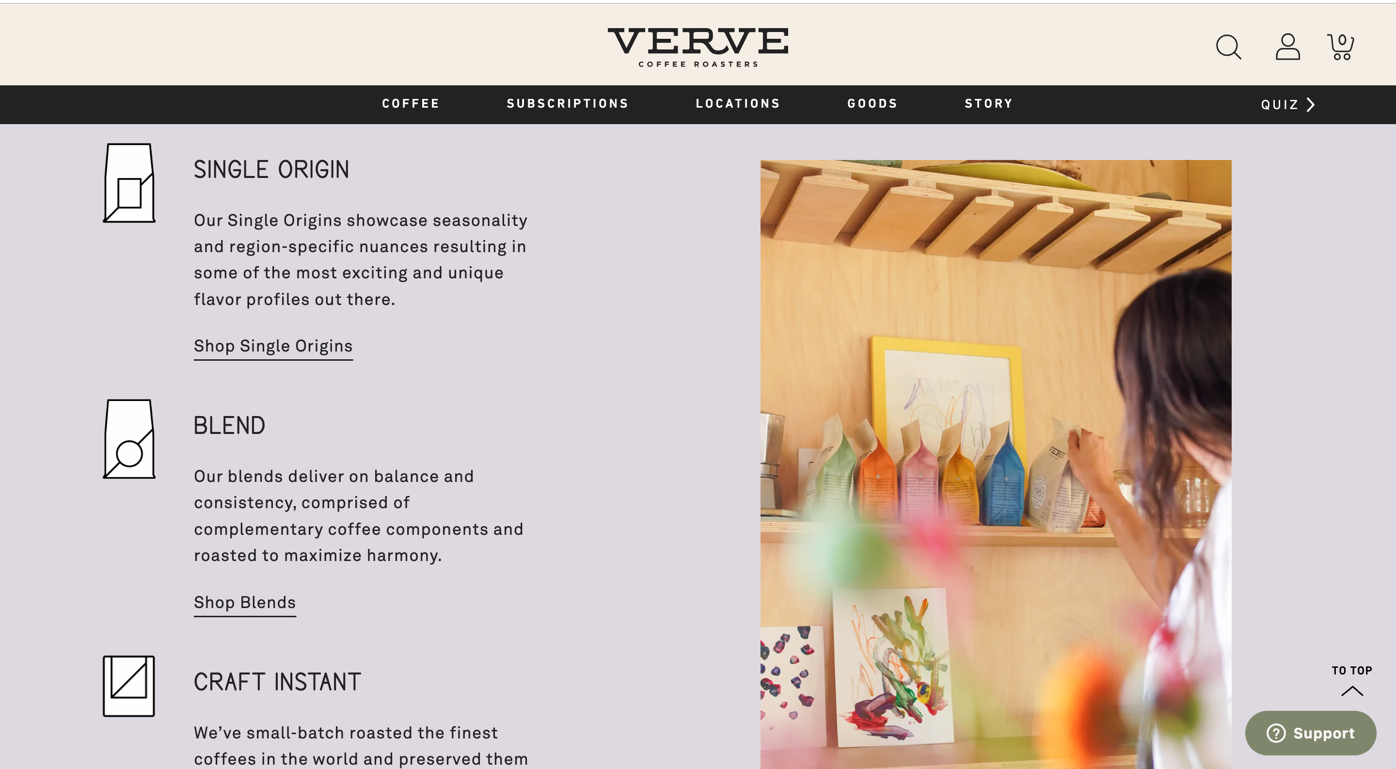
A hero image of your “signature” product on the home page is one good UX practice. But what else should you have on your store home page? Present popular product subcategories in subsequent screens to direct users to other areas of your website.
By highlighting different categories on the home page, shoppers can get straight to more relevant site areas without relying on the site’s main navigation or search feature. Minimizing the steps in the purchase path is one of the popular conversion rate optimization (CRO) strategies for e-commerce websites.
Verve Coffee Roasters progressively reveals its full inventory on the home page. On each new screen, the coffee e-tailer displays the latest coffee blends, seasonal summer offerings and then classic categories of coffee blends.
3. Provide Preview for Visual Products
Neiman Marcus
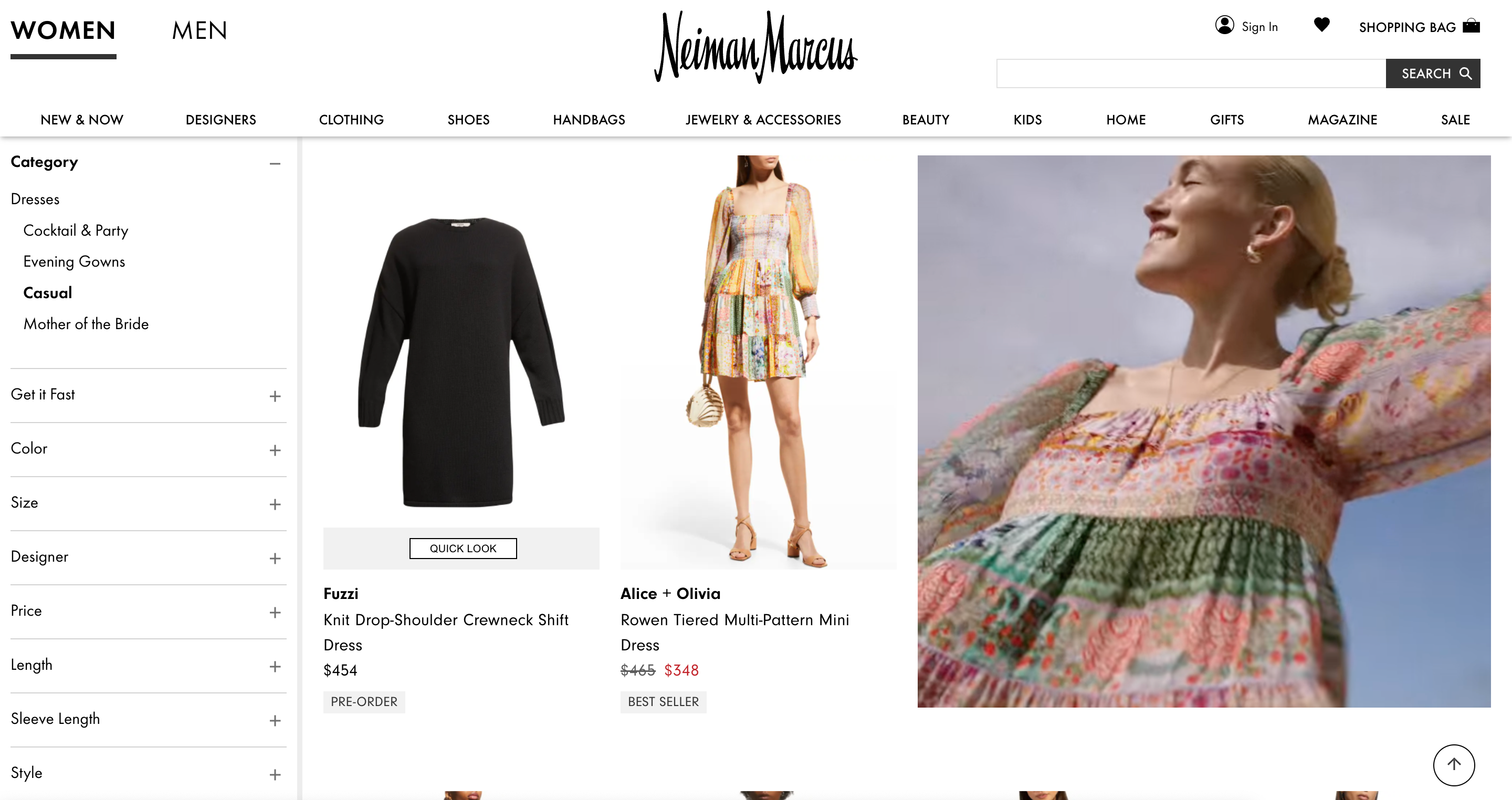
Improve your visual merchandising by adding a “Quick Preview” option for results displayed on product category pages. When browsing an online store, many shoppers may be cautious about visiting a product listing because that would slow down their research process. Forcing them to open multiple tabs or switching back and forth between product lists and individual product pages also builds up frustration, especially among mobile users.
A “Quick Preview” feature allows users to stay on the main product list page while quickly checking multiple products before finalizing their choice. This design technique works particularly well for visually driven products such as clothes, accessories, jewelry and furniture, among others.
4. Create a Convenient Content Taxonomy
IKEA
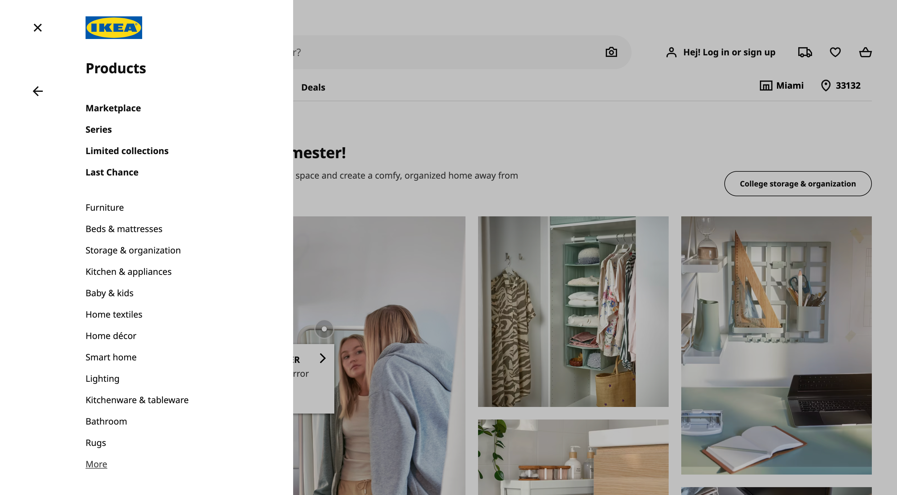
Retailers with larger product catalogs have to concentrate more on website taxonomy. Website taxonomy is a logical structure you create to group different pages into categories so users can better navigate between pages.
Divide your product catalog into right-sized categories and subcategories. Your goal is to create a set of mutually exclusive category scopes so that the same product isn’t listed multiple times under the same category or subcategory. IKEA solves this by organizing all products into descriptive categories and subcategories.
Directing users towards overly narrow category scopes can make users underestimate the size and diversity of your inventory. On the opposite end, giving too many choices within one category leaves shoppers overwhelmed. Also, avoid using shallow parent categories: text descriptions that don’t lead to a respective sub-page. This way, you’re wasting valuable virtual space within the limited navigation menu.
6. Minimize Form Fields on Checkout Page
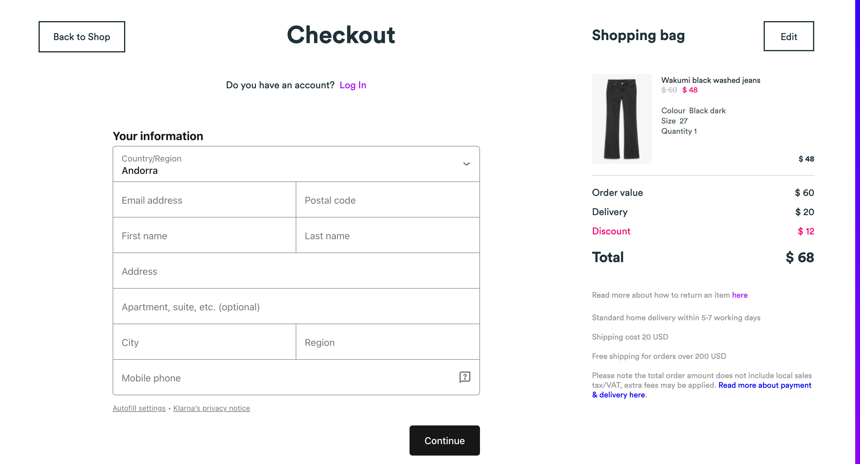
Monki
The average checkout form completion rate on e-commerce websites sits at 46.4%. If you’re losing more customers at this stage, reduce the number of required form fields and checkout steps. The average checkout flow is over five steps long and has 11.8 form fields.
However, many e-commerce websites can get by with a total of eight form fields. Request only essential information for delivery and payment. Delay account creation or loyalty program subscription to the next screen or a separate post-purchase step.
You can always prompt account creation in the follow-up order confirmation email. At this point, the user is thrilled with finalizing the purchase and, therefore, more likely to complete account registration or sign up for your loyalty program.
7. Display Product Reviews and Ratings
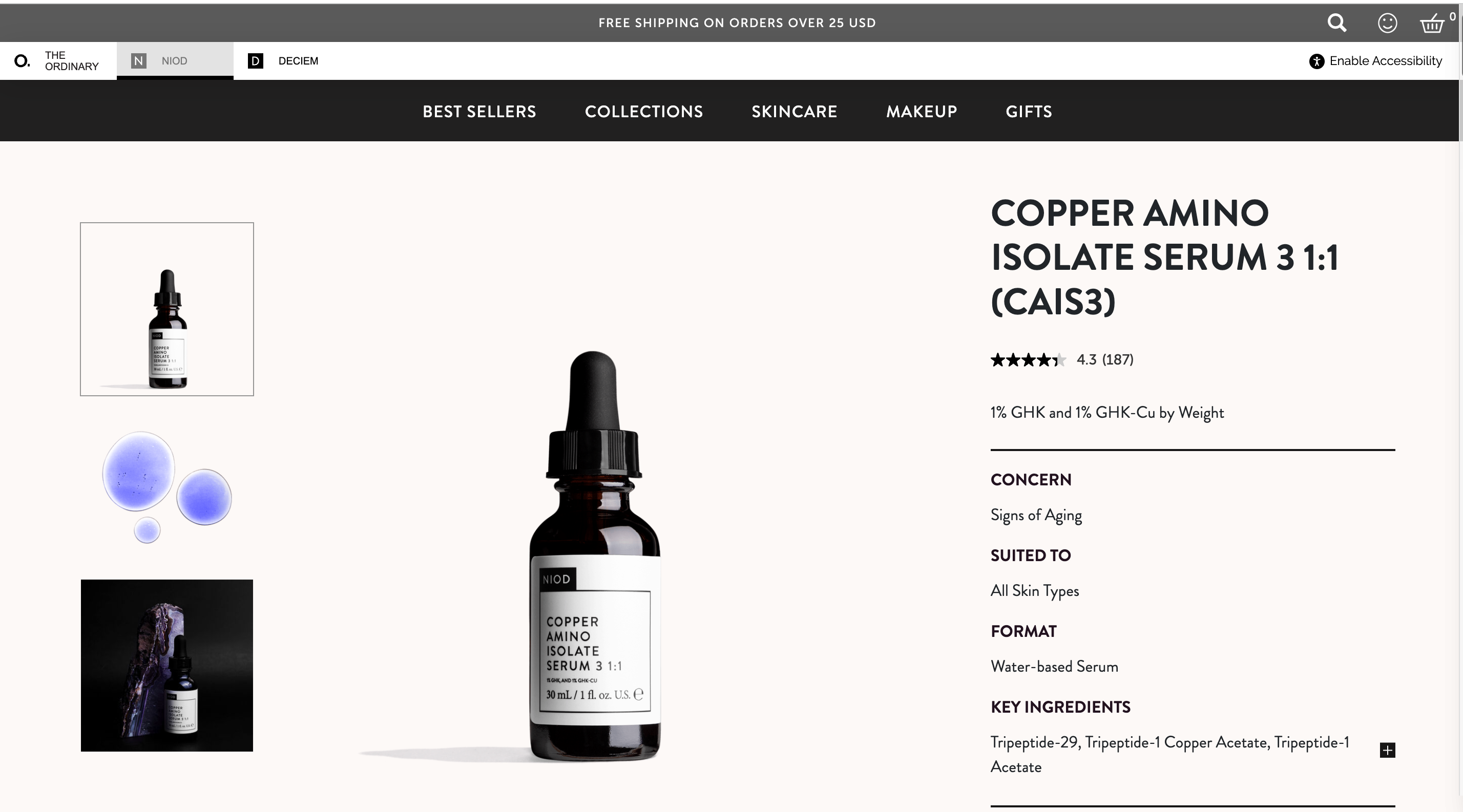
NIOD
Shoppers mostly rely on verified product reviews when deciding on a purchase. Statistically, the likelihood of selling a product with five reviews is 270% higher than a product with zero reviews. If your goal is to maximize your conversion rates, design a review area. A good practice is displaying a numeric rating next to each product as NIOD does—and then designating the bottom of the product listing page for detailed customer reviews.
You can also design a standardized product review form with prompts for writing to get more product reviews. For example, offer a drop-down list of choices for age, product size, preferred fit or other evaluation criteria your shoppers find important. A template reduces the cognitive load a person experiences when seeing a blank page. It also helps get more valuable feedback and precise ratings.
8. Minimize On-Site Pop-Ups
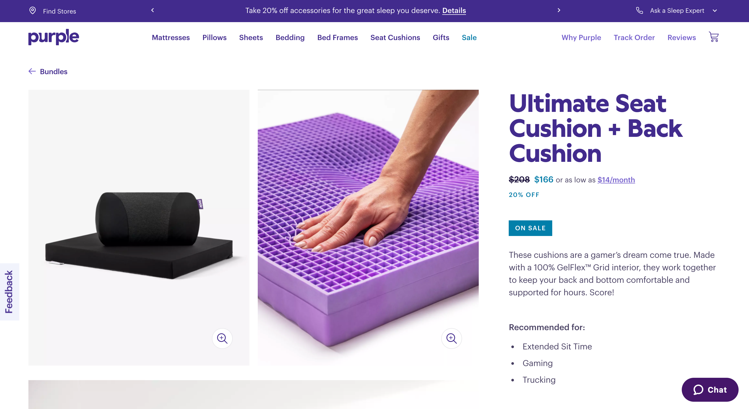
Purple
Pop-ups are mostly seen as annoying and disruptive, especially when they are automatically programmed to emerge within several seconds after visiting the page. Instead of highlighting important information such as a discount code, feedback form or live chat support as a self-activated pop-up, design them as static, sticky UI elements.
Purple added a sticky bar atop the header menu for current promotions and hid “chat” and “feedback” behind buttons in peripheral zones. All of this information remains in short reach for consumers but doesn’t distract them from browsing the available inventory.
9. Create a Prominent Search Bar and Keep It Visible
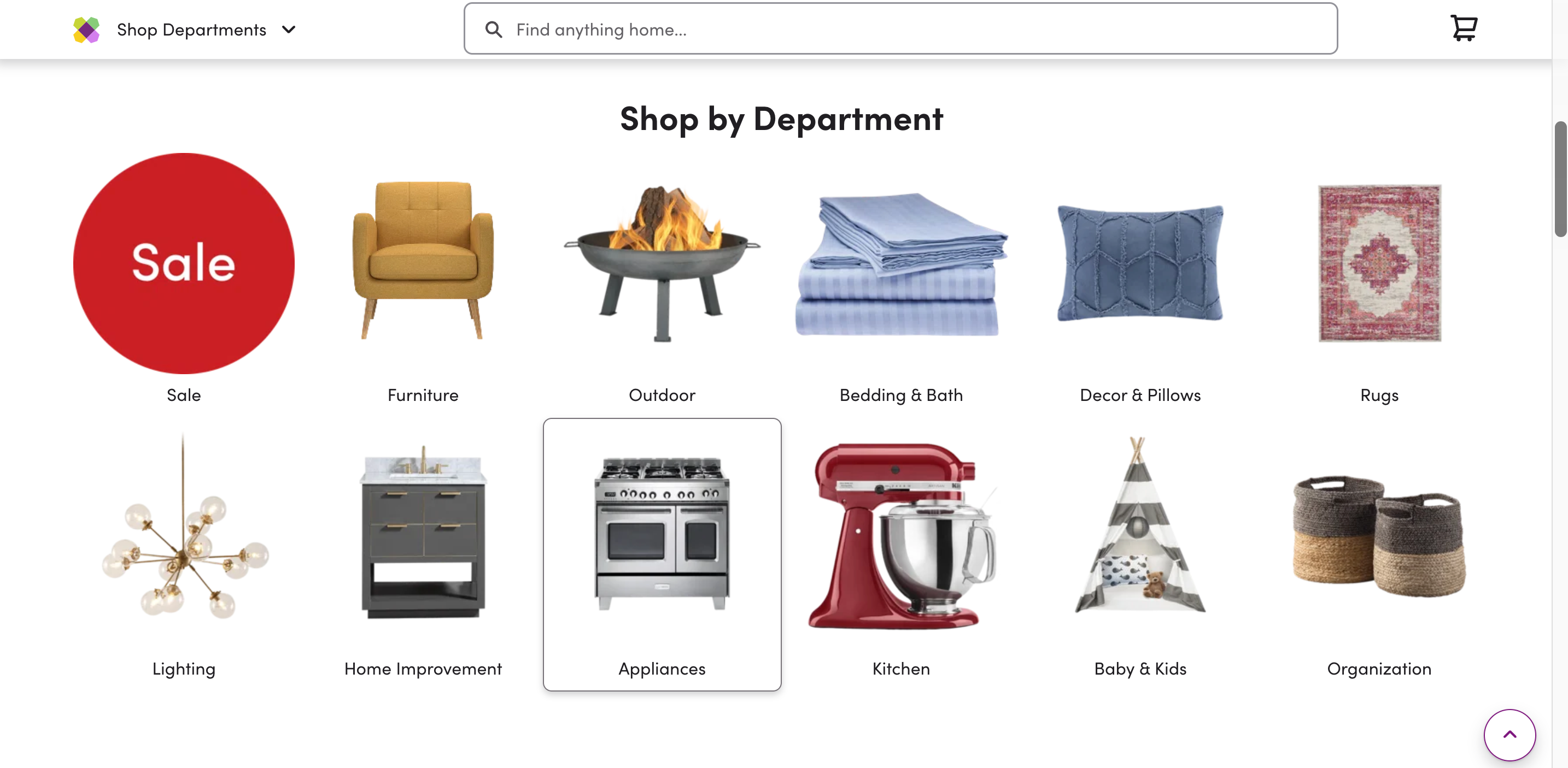
Wayfair
Site visitors use “search” as a fallback strategy when they get stuck with navigation or want to quickly locate specific products or pages. Similar to main website navigation, the search bar has to be well visible.
Wayfair smartly uses a sticky search bar to help shoppers navigate its huge product catalog. It remains visible as users continue to scroll through product listings. You can also make your search bar more prominent by using bolder borders, contrasting background colors or different fonts.
10. Include Search Auto-Complete
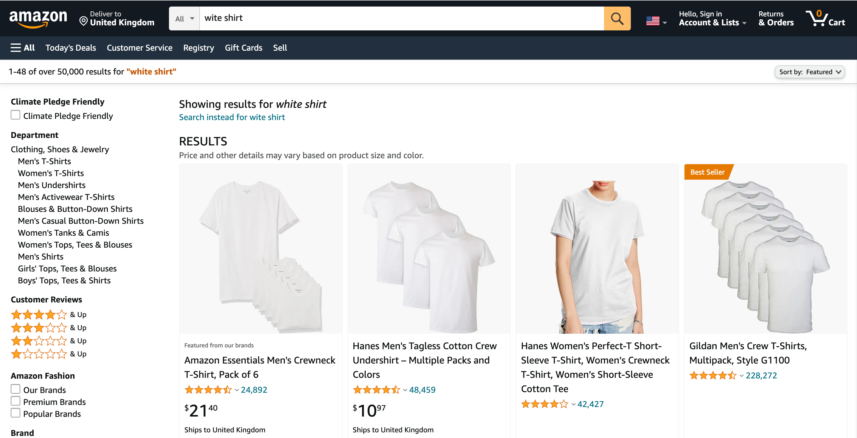
Amazon
Search plays a significant role in customer interactions. Yet, one in ten search queries on the web are usually misspelled—and typos often happen on e-commerce websites. Search auto-complete can help minimize the impact of minor typos on product discovery.
However, many e-commerce sites don’t support auto-complete spelling suggestions or fail to provide relevant product results for mistyped queries. That’s an oversight because the on-site search auto-complete feature can help retailers improve conversion rates by a sizable notch.
On Amazon, the conversion rate for shoppers who use on-site search is 12.29% versus 2.17% for those who don’t use the search feature. That’s six times higher conversion rates and extra revenue.
11. Provide Direct Access to Products in Inspirational Imagery
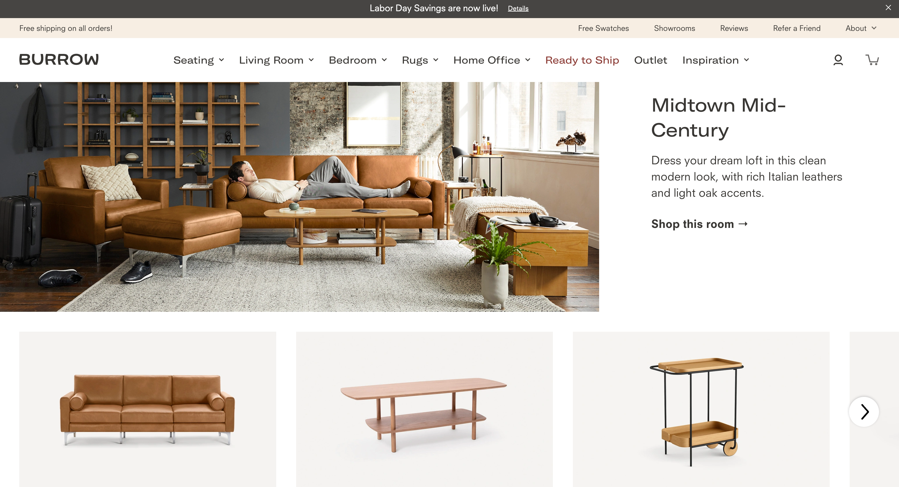
Burrow
Lifestyle and inspirational visuals help shoppers better visualize the products in real-life settings. Also, a catalog-like product presentation presents an excellent opportunity for upsells. You can offer users to shop the entire “room,” “look” or “routine” and improve your average order value (AOV) this way.
However, finding the depicted products or shopping the entire look can be daunting when you offer no clear path to select the products on display. Over 90% of top-performing e-commerce websites now include links to products shown in inspirational visuals. An alternative option is curating the suggested range in a carousel view below the lifestyle shot.
Bottom Line
The goal of your e-commerce website design is to turn a casual browser into a loyal brand shopper.
To make that happen, test different strategies for improving website navigation, checkout flow, product presentation and all-matters customer support. UX design is an ever-evolving field. Develop new assumptions and design hypotheses, then test them on your site to develop a new “best practice” for your brand.
