Top Web Design Trends 2024

With a huge emphasis on user behavior and engagement, the web design sphere constantly changes to establish strong brand positioning through web identity, meet the target audience’s needs, and fight tough competition. From small and fleeting solutions to big and long-standing techniques, it is an ever-evolving landscape with lots to offer to those who want to reinforce brand value and keep things interesting. In 2024, web design trends have evolved to prioritize even more immersive and personalized experiences. Designers are leveraging advanced technologies like AI and machine learning to create dynamic, user-centric websites that adapt in real-time to user preferences and behaviors. This shift has brought about a new era of interactive design, where websites are not just viewed but experienced, offering unique journeys for each visitor.
The aesthetics have also transformed, with bold color palettes and unconventional layouts becoming the norm, breaking free from the traditional grid system. Accessibility and inclusivity continue to be at the forefront, ensuring that web experiences are seamless and enjoyable for all users, regardless of their abilities or devices. As a result, web design in 2024 is not just about how a site looks, but how it feels, reacts, and connects with its users, making every online interaction more engaging and meaningful.
2024 is going to bring multiple dynamic and graphic solutions. We have stepped into an era of reactionary design that revolutionizes both digital aesthetics and functionality. Creating experiences that resonate, engage, and inspire is what we strive to achieve these days. Let’s consider top web design trends in 2024 to understand what changes will redefine the website industry and get in the right direction with upcoming web projects.
Read more about previous trends:
Also, we recommend reading the email design trends showcase.
Recap of Essential Web Design Trends in 2023, Prepare for 2024
Before moving to the list of web design trends for 2024, it is crucial to look back at 2023. It was a prolific year rich in multiple trends, starting with text-only hero areas. Many web design teams opted in favor of image-less home screens. It allowed them to exercise their wit and creativity with typography and color to draw visitors’ attention to the key message and brand identity values without visual overload.
Focus on typography continued to grow with other fantastic trends along the way. We witnessed magnificent website designs with overwhelming text. Web designers pushed their boundaries to incorporate big and loud typefaces into the layout. Many of them were pretty primitive, but they did their job perfectly, capturing overall attention with grandiosity.
Another trend in the typography niche worth mentioning was small animated text elements that, as a rule, were presented in a round shape. Spinning circles of text were here, there, and pretty much everywhere. Playing different roles, from decorative to functional, they were focal points that gave the user experience a certain edge.
If that was not enough, another trend emerged several months ago. A powerful combination of text and motion started to excite web designers’ minds. Artists tested different approaches to provide users with stellar interactions: reading in motion, the moving text layer on top of the video, oversized typography in tandem with moving background, flying pages, and carefully scattered letters. Notably, this trend is gaining momentum today, so expect it in 2024.
Figma to Website in One Click and No-Code
Siter.io – No-code landing page & portfolio builder
This year we’ll continue to see the rise of no-code web design tools such as Siter.io, which will make easier to create websites.
Another direction that designers seemed to love to play with was images and videos. We saw many professional pictures that looked delicious, vertical photos and videos displayed at different parts of the website, video-based hero areas, pure image hero areas, and stickers.
The latter was one of those “come-and-go” trends, but it was certainly fun to exploit. It proved that social media had and still has a huge influence on brand presentation in the web sphere. Sticker-style icons borrowed from beloved social platforms were popping up everywhere. They gave websites a lovely, playful appeal.
Stickers in the personal portfolio of Frank Reichard
Diego Pérez – UX & UI Designer
As for playful aesthetics, another interesting trend was the use of cartoonish characters. Having undergone a small revolution, 2023’s approach to this technique was more flat than skeuomorphic. Although it had 3D features, it still looked elegant and modern. Plus, it was powered by motions and dynamic effects. Next year, expect to see this trend, yet with AI-inspired models.
Color also underwent numerous changes during the previous year, from neon green and orange accents to some Accessibility-inspired combinations like dark mode, dark background with bright text (not necessarily white), and bold white lettering. On top of that, monochrome color schemes had a short yet noticeable comeback.
Finally, the layout. Regarding the arrangement of essential blocks and overall functionality, as a rule, designers prefer to play safe; however, in 2023, we saw some interesting takes on traditional components that made websites look modern and refreshing. This includes the following.
Side-by-side storytelling.
Storytelling is a huge trend, so it was no surprise that another technique in this area emerged last year. A side-by-side storytelling display erased clear borders between the left and right sides.
Sidebar elements.
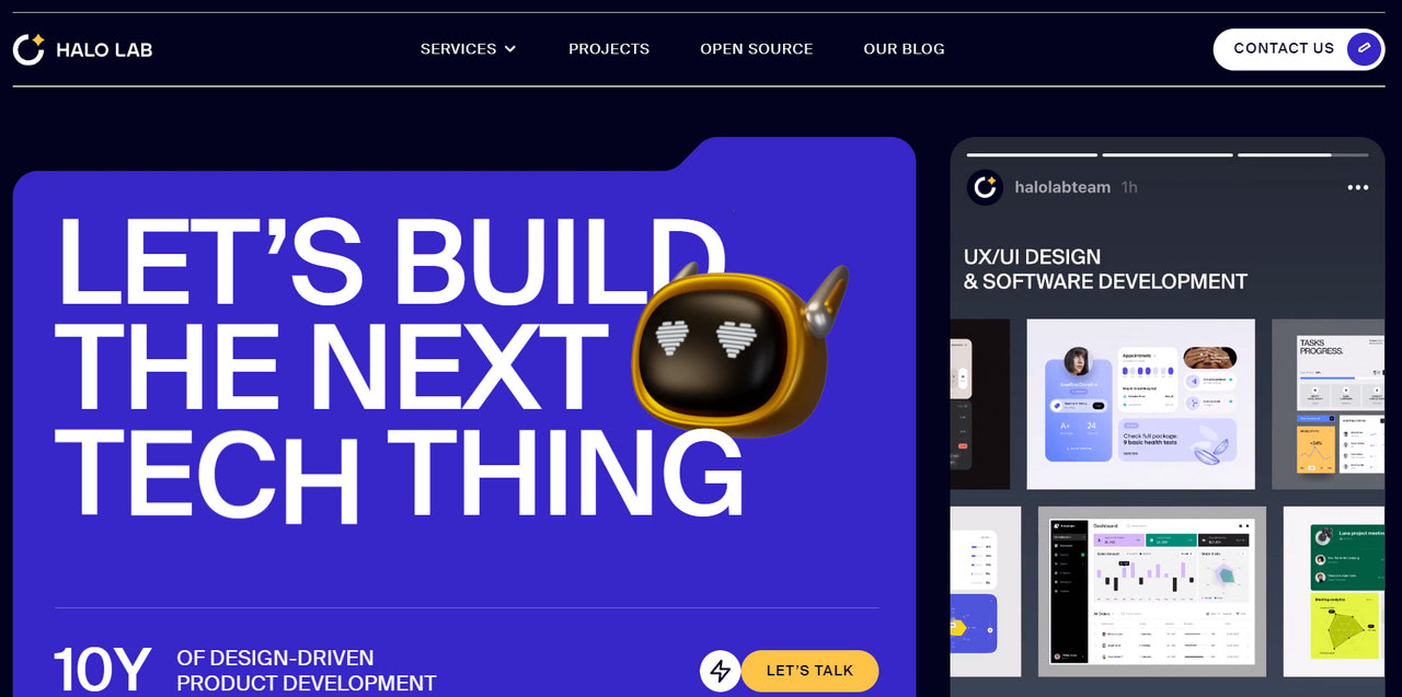
As a spin-off of the split screen trend, designers largely exploited this technique in 2023. Although it did not carve a sub-niche, it certainly stated its case, providing a more consistent visual experience between desktop and mobile screens. Expect to see its evolution because it meets users’ need for constant switching between devices.
La Presqu’île de l’Imaginaire – Festival d’art vivant, au château de Duingt
Boxed navigation.
Giving navigation a clear space, which viewers can easily delineate, became a necessity, not a trend, in 2023. Therefore, expect to see more emphasized navigation in 2024 to help users sail through the mass of information, visuals, and fancy design solutions.
Smooth card layouts with curved edges.
Beautifully working with other design elements and ensuring information is dished in easily digestible portions, this well-established concept keeps evolving, so expect to see it more in 2024.
Collage style.
It was seen everywhere. Many functional units benefited from it, including product displays, image galleries, and hero areas. Will it migrate in 2024? Well, we will certainly see some of them in portfolios and galleries since the approach is perfect for giving showcases a fancy touch.
Magazine-like alignment.
Big images, a wealth of whitespace, and oversized headlines were used to handle information overload. This trend appears almost every year. Web designers love to play with it and develop interesting takes on the approach. In 2024, they will certainly capitalize on dynamic effects.
Non-standard alignment.
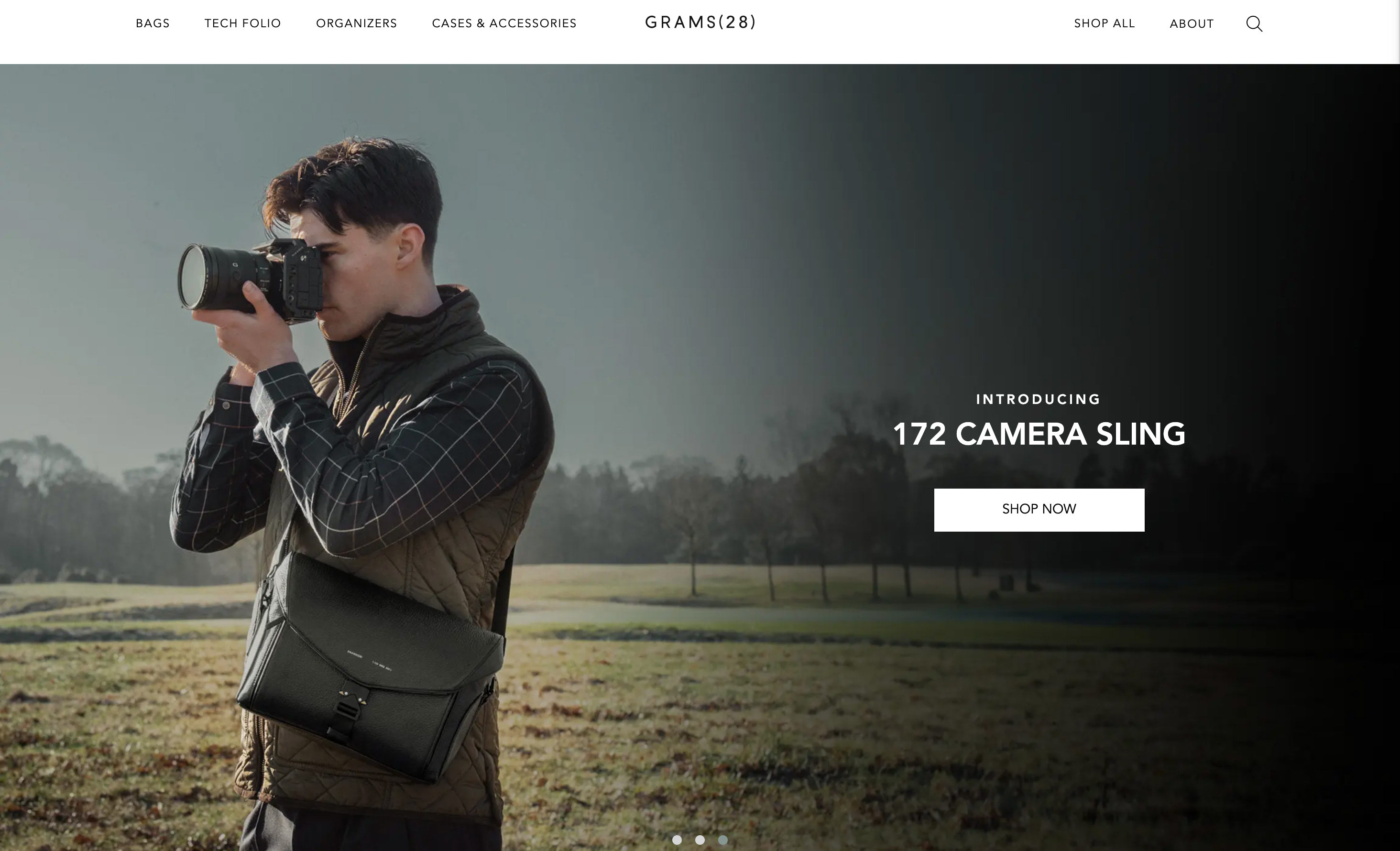
Ditching traditional symmetrical boxy layouts, this technique creates an on- or off-balance feel. The zig-zag alignment included vertical, horizontal, or even stair-step structures. The approach was great at separating projects from the others.
While most of those trends will disappear, some with a big momentum and growing popularity will see through and find their place in web designers’ arsenal next year.
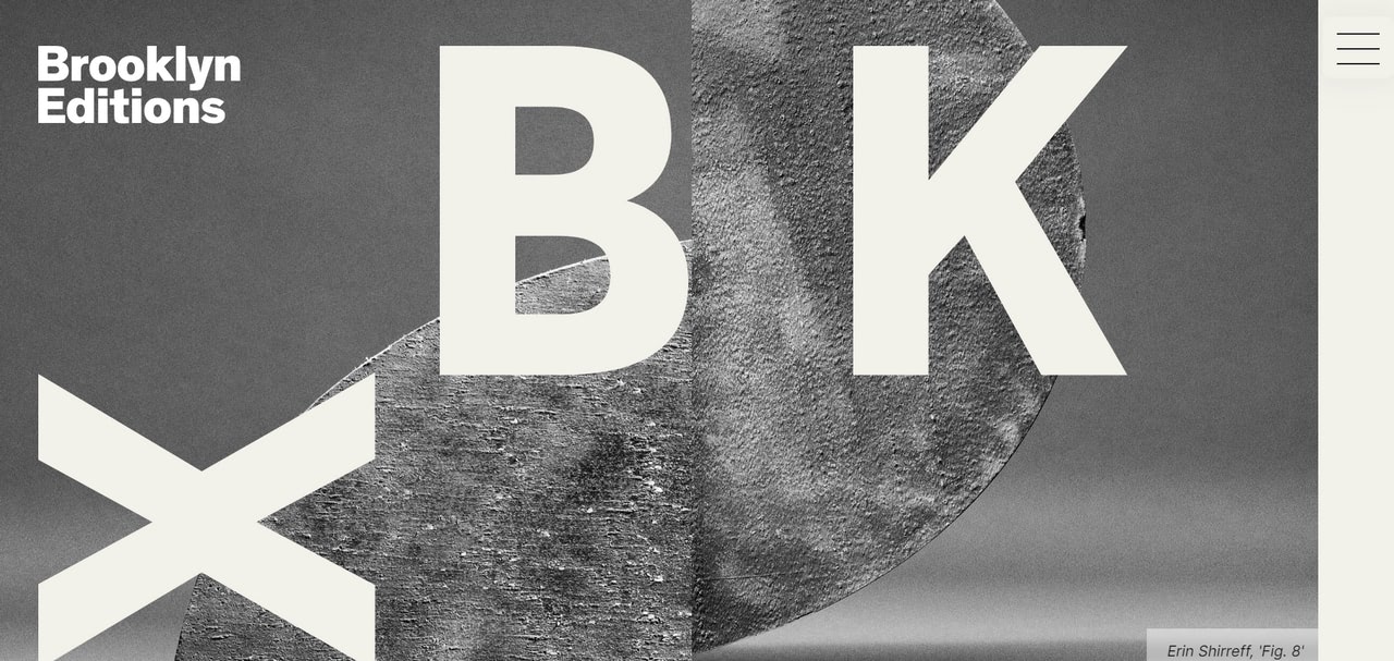
Magazine-styled layout in Brooklyn Editions
Web Design Trends for 2024
AI-Generated Content and Imagery
Finances Online says AI will grow into a multi-billion industry by 2025. It has already gained momentum and popularity across niches and verticals. There is no way it would stay aside regarding website design.
In theory, AI can empower every aspect of a website: appearance, functionality, accessibility, user experience, interaction with visitors, consumer targeting, and even marketing aspects. In fact, it is far away from that.
Nevertheless, more and more designers are shifting towards AI-based design practices, and more and more clients are craving AI-powered experiences. This sphere intends to become an indispensable part of modern web development.
Last year, we saw how it already commanded several key aspects of web design, mostly holding a deciding role in UX. For instance, chatbots have become a fixture of almost every website. Machine learning procedures and NLP allow business owners to bridge the gap between them and clients by creating pre-programmed conversational pathways and making interaction more productive.
In 2024, more and more websites will be equipped with AI assistants. To avoid being too intrusive, pushy, or overwhelming, prepare to allocate a certain space for the chat box and define the best position and behavior pattern for this element. It will also be your task to integrate it into the website environment and, at the same time, align it with the brand identity.
Another direction in this area concerns the widespread adoption of AI-generated designs. This tendency will continue to transform the web design world in 2024. Midjourney, DALL-E 2, and Generated Photos, which develop graphics based on a simple human prompt, opened huge opportunities for web designers. Digital artists can create custom website graphics based on their vision, user data, and design systems. Expect to see more website designs with AI-generated imagery.
We could not help but mention the use of AI models as a growing trend in this area. Companies want to position themselves as forward-thinking through an ultra-modern online presence. This means they will try to connect their businesses with AI. In web design, this can be done using human-like models and mannequins. Either digitalized or vectorized, they certainly make the brand look progressive. Therefore, we will see different solutions in this area.
Last but not least. Before diving headlong into this trend, it is crucial to remember that AI has legal problems and raises ethical issues. Therefore, potentially, there will be some pushbacks along the way and fallbacks that must be mitigated.
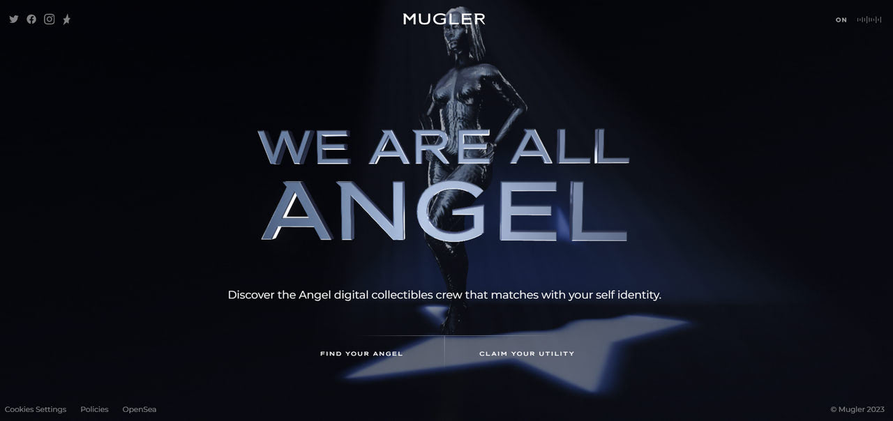
Emotional interaction with Generative AI Chat
Uplift – Optimize human movement performance with AI-powered insights
Techno and Sci-Fi Storytelling Experiences
In continuation of the AI trend, web designers will exploit techniques to make websites feel futuristic, advanced, and high-tech. In the World of biometric authentication, VR, robotized services, cryptocurrency, and digital assistants, this trend reflects the current situation and, most importantly, meets the market’s expectations for technically advanced companies.
This demand will only grow, leading to websites with techno vibes, sci-fi scenes, and WebGL environments. We have already seen that, and 2024 will not be any different. Not only will fintech and tech startups follow this trend, but also other industries.
As AI extends its sphere of influence across all verticals, changing how people perceive companies, more businesses will recognize the power of adding techno vibes to their web presence.
To enter the era of innovation, you may start with these simple approaches:
- universe-inspired environment;
- futuristic graphic designs and illustrations;
- phenomenal animations;
- dynamic geometric objects and typographic pieces;
- micro-interactions;
- dark color scheme with a generous amount of whitespace;
- custom futuristic typography;
- abstract design with sleek graphics;
- impressive 3D animations;
- motion and dynamic effects;
- gamified experience;
- neon colors;
- robots, AI models, and sci-fi-inspired characters;
- motion graphics.
These are the most popular options for creating a sci-fi storytelling experience with a techno vibe and futuristic appeal. However, you are welcome to push boundaries and test the limits of technologies.
There is only one thing to remember: for the sake of a good user experience, it is crucial not to overdo it. While the audience prefers a dark environment over a light one due to its ability to reduce eye strain and blue light that can interrupt sleep, you still need to take measures to provide optimal readability in your cosmic-inspired design. On top of that, many pioneering techniques are still widely unsupported, so fallback must be present.
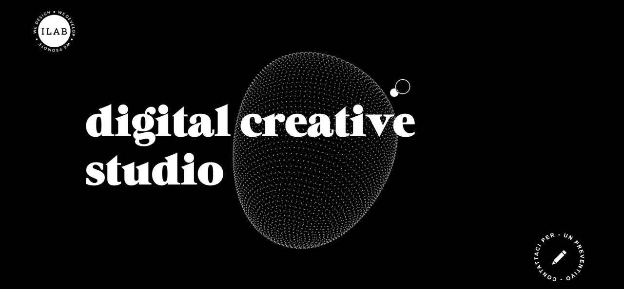
Personal portfolio of ILab with techno centerpieces
Interactivity and Motion Effects
For what the future seems to unfold, interactivity is a technology without alternative, though at least for now. Interactivity, along with motion effects, have carved a niche for themselves. They are so popular that even Forbes encourages people to make their websites interactive ASAP, backing their appeal with these strong reasons:
- It drives engagement, which is crucial for customers with short attention spans.
- It keeps attention.
- It makes conversion effective.
- It builds stronger relationships with customers.
- It provides extra revenue.
- It offers a transparent way to collect information about visitors, their behavior, and their preferences.
With such a big potential, this trend will only continue in the years to come. In web design, we are going to see more and more interactive projects and motion effects. From micro interactions scattered across the website that add intuitiveness and meaningfulness to the user experience to motion effects applied to traditional design elements like typography, buttons, or icons to huge and immersive worlds reproduced to blow customers’ minds, we are stepping into an era of non-static web projects and applications.
As practice shows, web designers will be limited only by imagination and technology. We have seen multiple projects powered by WebGL and libraries alike that impress with fantasy worlds and unforgettable experiences. Web designers add musical backgrounds, recreate 3D Worlds, and build artistic playgrounds to take visitors on a fantastic journey. Some of them get so obsessed with the mainstream that they even ignore the target audience’s ability to support technologies.
As for motion effects, we have already seen how they were used in tandem with typography and graphics. With storytelling experiences where motion effects thrive, showing no signs of stopping, expect to see more of that approach in 2024.
However, it is important to note that this trend has another side of the coin. Websites have become overly animated and interactive, causing visual overload. Some of them even have a bad and inaccessible user experience. Therefore, digital artists might consider interactivity and motion effects as complementary tools that support the meaningfulness and intuitiveness of the user experience.
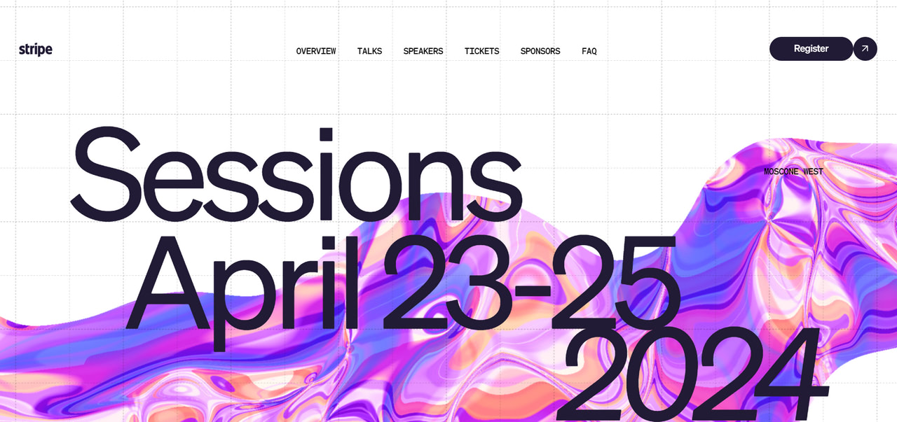
3D comic strip made with splinetool – Anton Repponen
Parallax Scrolling
Parallax scrolling has been with us for ages. Surprisingly, it always finds its way to the new year, emerging with original techniques that blow users’ minds and excite designers with possibilities to impress and deliver the brand message.
Thus, the previous year, we saw so-to-say multiplanar scrolling. As users scroll down, they encounter content that moves across the x-axis and z-axis. Some websites even revealed content backward along the z-axis or recreated the zoom effect.
This is a sign that parallax scrolling has become an integral instrument to play with when designers let their imaginations run wild. However, it comes with other advantages as well. For instance, it goes perfectly with all sorts of animations; it underlies the foundation for one of the beloved trends, storytelling, and it may easily rejuvenate even the boring structure.
Therefore, it will stay with us this year, no doubt. Get ready to witness more scrolling extravaganzas. Mix it with high-tech solutions, motion effects, and interactivity to play along with the mainstream. If digital maximalism is not your cup of tea, you may always embrace minimalism and ditch all the visuals to show the beauty behind moving along the untraditional axis.
While building a website with parallax scrolling, remember there is always a challenge. Overindulging in parallax effects makes some users nauseous. On top of that, readability and marketing strategy may suffer. Therefore, balancing creativity and functionality to ensure optimal user experience is highly recommended.
Another issue with the trend is that scrolling on a desktop may seem like a wonderful pastime, but on small mobile devices, it may feel like ages. No one is eager to spend their precious time on that. Therefore, compromise must be made. Some content and graphics must be eliminated to keep users engaged. You may adopt the popular solution of image-scroll-animation combination because it is easier to digest or choose only key messages and use different dynamic effects to make the experience non-monotonous.
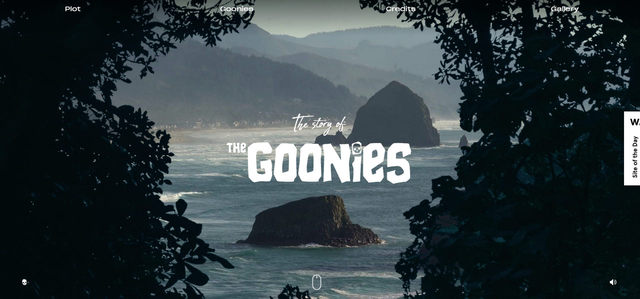
The parallax-based Story of Goonies
Typography Madness
The tendency to emphasize typography was noticed in February last year. It was then that many projects featured big, bold lettering, interesting custom typefaces, big variances in size or color, and even tiny type animations. It was not as if typeface came onto our radar for the first time. Every single year prides itself on trends in this area. Though, there is no surprise. Typography is a time-proven way to speak directly to the target audience, add a creative edge to website aesthetics, and make the message impactful.
2023 was no exception, and neither will 2024 be. After all, everyone loves to play with letterforms. There is something satisfactory in developing a way to display information, deliver brand value, and connect the text with overall aesthetics through just one UI element.
So, what to expect next year? Some trends will migrate since they are gaining momentum, and everyone wants to try them. Consider the following options as a starting point.
Kinetic typography
Perhaps this is one of the most popular and unquenchable trends fueled by the growing popularity of motion effects and dynamic solutions.
It is animated text that turns simple typography into an engaging visual element that conveys a message and entertains. It also draws attention and creates a consistent user experience, keeping visitors engaged. Web designers will play with this trend and integrate it with other design elements to bring an immersive experience.
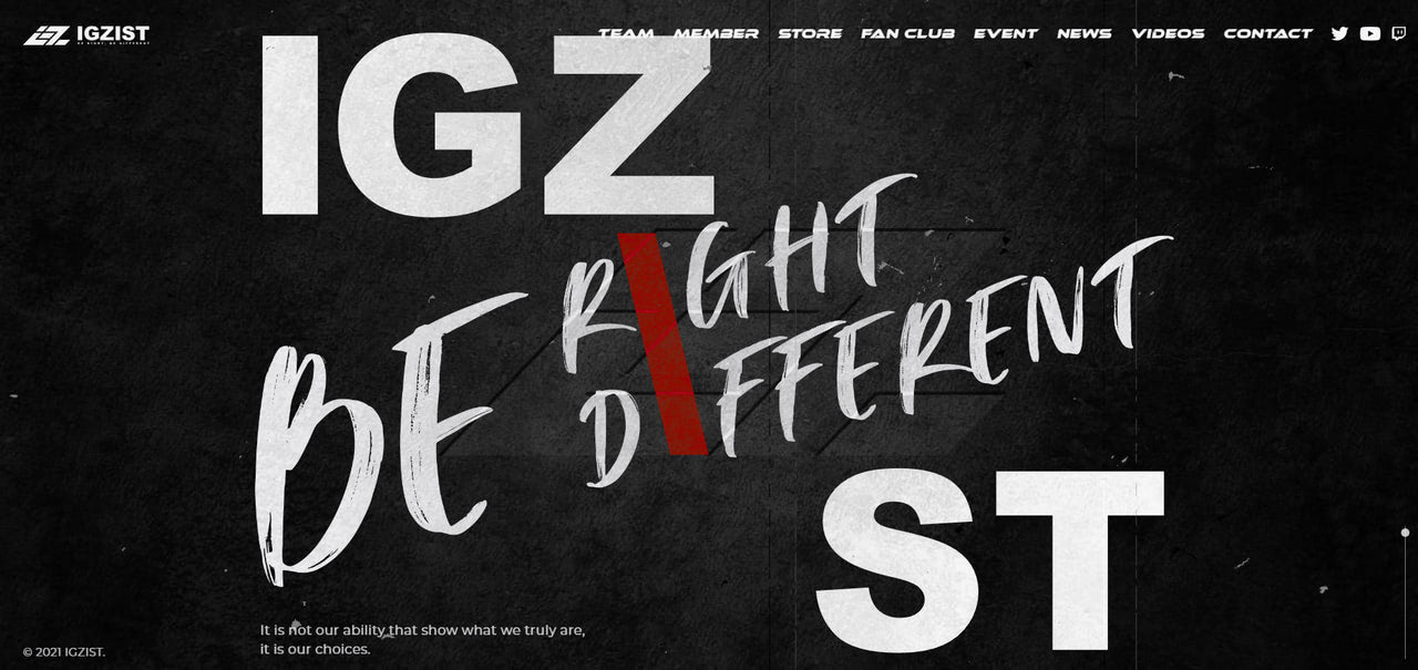
Teleprompter typography
The technique implies revealing chunks of text step by step, from a not-so-readable light to a very readable black as the user scrolls down the page. It also works great for visually-heavy websites since it may focus users on the impressive imagery and only then reveal the supporting text.
Typographic design
Surprisingly, despite a growing obsession with AI-generative images, it is still here. This oldie-but-goodie approach unlocks typography’s power to act as a graphical element. It uncovers its potential to catch overall attention, generate emotions, leave an impact, and deliver a uniquely branded message.
To follow this sub-trend, consider the typeface as a graphical instrument. Ditch other design options and let letterforms speak for themselves, becoming a central extravaganza. In 2023, the trend was used to adorn hero areas. Next year, it will certainly expand its influence over other sections. There are already websites that have done that.
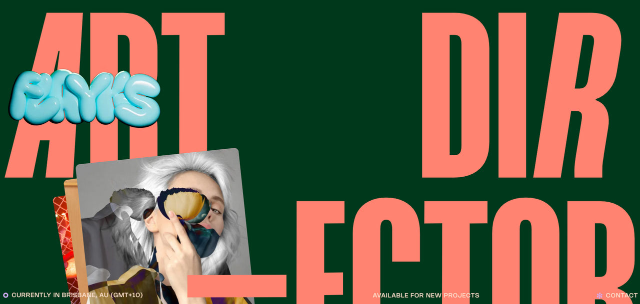
Y2K
According to studies, people are feeling more nostalgic than ever. They look back to simpler times for comfort and escape due to the last few turbulent years of COVID-19 spikes, global economic crises, and war conflicts. Even Gen Z respondents said they feel nostalgic for the 1990s.
These moods have not gone unnoticed. In 2023, we witnessed Y2K fashion, songs from the 90s hitting the top charts, and even movies with 80s flair making a comeback. The web design sphere was no exception. We saw multiple websites with retro vibes. Web designers paid homage to the 80s and 90s by skillfully incorporating geometric shapes, abstract patterns, pixel art, and other integral elements that hint at the early digital era.
As for 2024, the trend will stay because the mainstream is global. Expect to enjoy more Y2K designs and aesthetics that meet the target audience’s mood and tap into the millennial and Gen Z obsession with retro things.
How do we follow this trend? First of all, you should understand the specificity of Y2K. It is a unique blend of retro-futurism and digital aesthetics. You may try bright neon colors from green to pink, unconventional combinations of tones, and glossy and reflective surfaces.
Second, follow just one direction. For instance, you can bring about retro-futurism, which is already highly popular among the crowd and designers. This implies combining nostalgic retro style and ultra-modern elements, using smooth and blurred gradients.
Third, nod to the space age, incorporating blobby shapes, bright, shiny metal textures, and cosmic motifs. Get inspiration from sci-fi movie scenes like Star Trek, Tron, or Matrix.
Fourth, dive deep into 90s hip-hop styles. Bling, flash, exaggerated forms, rave culture, candy bright colors, and psychedelic imagery may easily do the work for you and set the right atmosphere.
Finally, mix modern animations, style options, and retro elements like pixelated or low-fi images and rudimentary animation, especially spinning shapes. Spice up everything with an appropriate color scheme and chrome, metallic, or holographic effects.
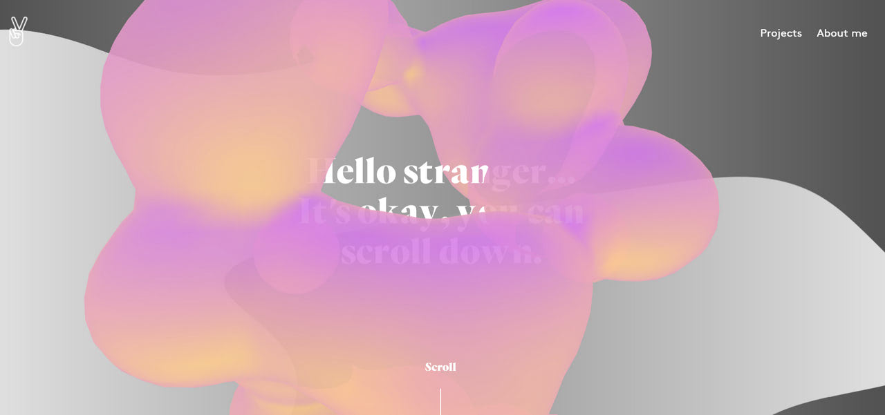
Personal portfolio of Julie Bonnemoy with a retro vibe
Digital Maximalism
Maximalism made a well-deserved return several years ago, allowing web designers to run their imaginations wild and giving them much-needed freedom to experiment in an open environment. And it feels like no one wants to get back to restrictions and adherence to severe simplicity that negatively affects creative thinking. Everyone is eager to show off their skills, push boundaries, and test their limits.
There is no better time since browser support for all extravaganza that web designers want to create has improved greatly. Plus, the audience is tired of websites that look almost the same. They want some madness in the websites to enjoy the one-of-a-kind user experience.
The beauty of digital maximalism is that it is a no-holds-barred approach. Web designers are encouraged to go wherever their creativity takes them, with no boundaries. Who would not like that? Therefore, expect to see more of this tendency in 2024. Sites will be full of color, textures, patterns, dynamics, micro-interactions, custom letterforms, and geometric objects, creating a sense of complexity and ipso facto immersive user experiences.
If you also want to move further away from clean and minimalist designs, here are several characteristic traits that shape digital maximalism and could be used to pull off something similar.
- haphazard placements of elements on the screen;
- a mixture of contrasting motifs and colors;
- bold, clashing, or frenetic color schemes;
- vibrating dreamlike typography;
- layering aesthetics with a mixture of text and images;
- dense, bold, and screaming headlines and text;
- the chaos of tiny details and moving objects;
- scribbled drawings and scrawled lettering.
It is crucial to note that digital maximalism is not only about graphical constituents. It is also about taking advantage of the modern-day technologies. Therefore, web projects will be powered with motion effects, dynamics, and parallax scrolling.
On top of that, they will feature typography extravaganza, interactive details, and other trends that find a response from the target audience and keep them on the project.
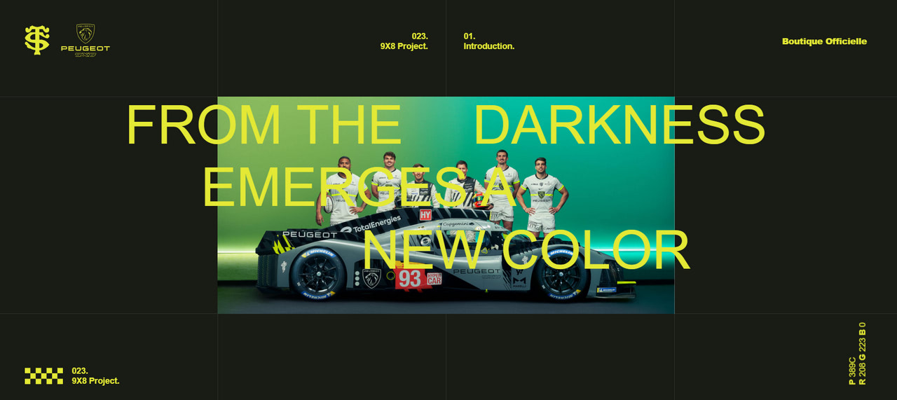
Homepage of Stade Toulousain with immersive digital experience
Conclusion
In conclusion, the web design landscape of 2024 is a testament to the remarkable strides made in technology and AI, significantly transforming user experiences online. The integration of advanced AI and machine learning technologies has been pivotal in creating websites that are not only visually striking but also highly intuitive and responsive to individual user preferences. This innovative approach to design has ushered in an era of dynamic and personalized web experiences, where each interaction is tailored to the user’s behavior and needs.
The focus on accessibility and inclusivity, driven by these technological advancements, ensures that the web is a welcoming space for all users, regardless of their abilities or devices. The bold aesthetics, breaking free from traditional norms, further highlight the creative potential unleashed by these new technologies. In essence, the evolution of web design in 2024, guided by AI and cutting-edge technologies, represents a significant leap towards making the digital world more engaging, inclusive, and responsive to the human experience.
Each year, a parade of trends refreshes user experience and allows companies to look and feel modern. Some cycle so quickly that it can be impossible to keep up, while others overstay their welcome, turning into a classic.
Depending on your brand’s strategy, you may follow even the smallest and most fleeting ones, but you should never let them dictate your actions. Many things underlie the success of the company’s web presence and market positioning. Following trends are among them, but being too vogueish may ruin everything. After all, there are web interface details like accessibility, mobile-friendliness, and value of content that turn visitors into brand evangelists. Modern tendencies should not compromise them.
The best advice is to be aware of those trends and play with them safely. Choose one that does not overwhelm visitors. Also, ensure it aligns with brand values and mission and resonates with today’s often-influenced target audience.
