Web Design Trends to Watch in 2024 — SitePoint
In this article, we’ll present an overview of recent web design trends, including artificial intelligence, futuristic minimalism, 3D immersion, dark mode, neumorphic design, artistic typography, and micro-interactions.
The world of web design continues to see technological developments, advances and new trends. Web design involves creating visually appealing and functional websites, and so it’s good for web designers to keep up with the curve, if not stay ahead of it.
Like every other field, web design had quite a number of trendy concepts in the year 2023 that have continued into the present year, and in this article we’ll explore some of the more noteworthy.
Artificial Intelligence
AI will replace designers, developers, writers and other tech professionals.
You’ve probably heard this or something similar in the last year. I’m a bit tired of seeing this all over social media, but no matter how convincing it seems, I’m not entirely convinced that AI will totally replace tech professionals, especially creatives.
There has been a boom in the use of AI tools and AI design tools. It’s no surprise that businesses now use ChatBox AI as a virtual assistant on their websites. Chat assistants are most often located in the bottom right-hand corner of a website, asking us to input our product/service query, navigational issues, recommendations, and so on.
While these tools are efficient, they have yet to reach the level of perfection people expect from them. However, web designers are using these technologies efficiently to improve performance, increase creativity, and, presumably, make more informed design decisions.
Some of the web design tools that have gained popularity among web designers in recent years include, but are not limited to:
-
Dall-E was created by OpenAI, Dalle.E 2 has grown in popularity in recent years as an AI tool for generating realistic digital images and arts based on text descriptions. Below is an image generated using Dalle-E.
-
Khroma is an AI color tool that can be trained to choose colors for you.
-
Vance AI is an image enhancement, generating, and editing tool that designers use to improve the images used in their designs.
-
Postcards AI can be used to design email templates.
These are just a few of the AI-powered web design tools available for use during a design process.
Futuristic Minimalism
Minimalism is a timeless concept in web design. It focuses on simplifying a web interface and leaving it uncluttered and clean, allowing users to focus on the essence of the site content. It basically entails creating “simple” and “functional” web designs.
Minimalism is also about prioritizing only the fundamentals in web design, which means using only the elements required to get the design ready for use.
The image below shows a minimalist design from Pinterest.
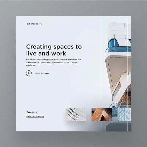
You can explore a few more minimalistic designs from Pinterest and Dribble here and here.
Minimal aesthetics such as clean lines, ample white space, and limited color, gives your website a sleek, simple, sophisticated appearance.
All this talk about the look of a website in minimalism isn’t to say that futuristic minimalism doesn’t prioritize user experience, for it does, while also embracing simple, cutting-edge aesthetics.
3D Immersion
If you’ve noticed websites feeling more immersive lately, it’s most likely due to the increased use of 3D features and VR in web design. 3D immersion in web design refers to designing websites that give users an illusion of depth and realism. This trend has gained popularity over the past year or so.
Imagine browsing a website and instead of seeing flat photos and text, you feel as if you’re entering a virtual environment or gazing through the lenses of an AR/VR Google. This can be accomplished by including 3D visuals, effects, and animations. 3D immersion creates a sense of depth, making elements on the web appear more interactive and realistic.
Take a look at the Avir 3D scroll website. You’ll notice how scrolling through this home website creates a sense of realism. It’s like users aren’t simply browsing this page, but “experiencing” it.
The video below provides a snapshot of the Avir website.
Web designers use techniques like scaling, rotation, horizontal scrolling, and parallax scrolling to achieve 3D immersion. They may also include 3D models, which enable viewers to interact with objects on the screen.
This 3D immersion trend enhances user engagement and creates a memorable virtual world browsing experience. It’s like adding a touch of virtual reality to the Web, making web pages both interactive and visually exciting.
The downside, of course, is that users on less powerful devices might find their device running slowly or the fan going into overdrive, so be wary of going down this path unless the payoff is really worth it.
Dark Mode
Dark mode isn’t new, but many who are used to it can’t imagine living without it. Take me, for example: every time I visit a website, I almost always look for a dark mode toggle button. Many modern websites now offer a dark mode option that optimizes dark mode settings for the site’s layout and design. Many others have just decided to go straight to the dark side without any other option.
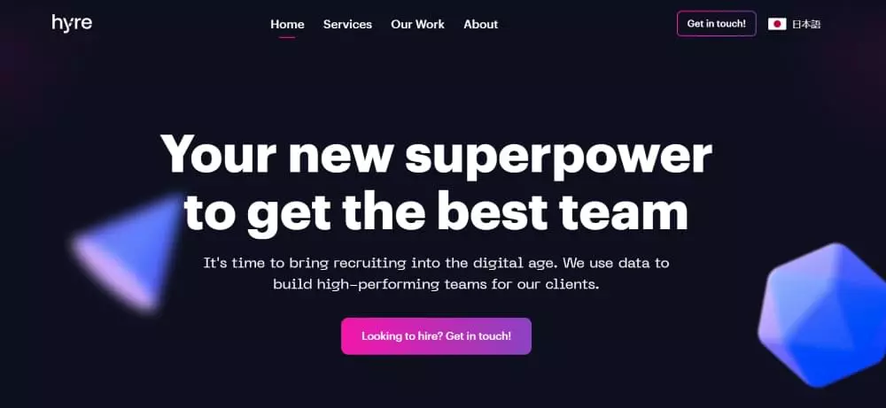
Dark mode is not a new concept in web design, but it has grown in popularity in recent years as more people become aware of the benefits of dark mode due to the contrast between web page contents and background. The Hyre website offers a nice example, pictured below.
Web designers implement dark mode in their designs for reasons such as:
- Reducing eye strain for users. (Be aware that dark mode can increase eye strain for some users, which is why it’s best to provide the option to turn it off.)
- Its aesthetics.
- Saving battery life. Research suggests that adopting dark mode saves battery life compared to using light mode.
Dark mode design also enhances visibility in low-light settings. Assume you pick up your phone first thing in the morning and switch it on; the bright light can be painful on the eyes. Using dark mode in a situation like this provides a more relaxing experience.
Given the favorable impact dark mode has on the majority of users, it has become a trend for web designers to incorporate dark mode/theme options into their designs, indicating that this is not just a passing trend.
Remember that dark mode design may be preferable to some people but not to others. To design accessible websites, web it’s best for designers to include a dark and light mode toggle so users can select which theme best suits them.
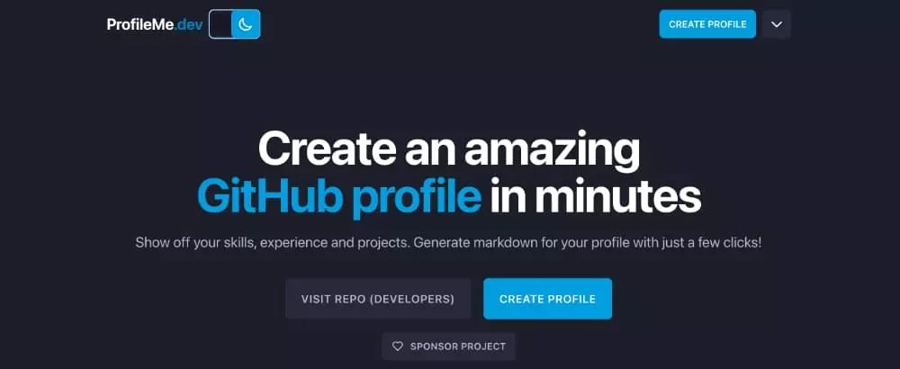
A nice example of a site with a dark mode toggle option is the ProfileMe.dev website, pictured below.
Read through Tara’s article to have a better understanding of designing in dark mode.
Neumorphic Design
Although neumorphism isn’t a new web design trend, it has gained traction and has become quite popular among web designers in recent years. Neumorphism creates a soft realistic UI that’s visually pleasing to users. Neumorphic designs typically feature soft shadows and subtle gradients, giving them a soft appearance.
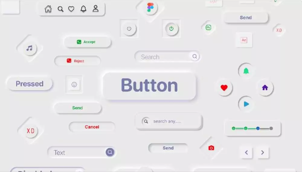
The image above show the neumorphism kit by Sayim Abdullah, from the Figma community. It displays some neumorphic elements like buttons, icons, and search input.
Now, check out Sourasith’s music app design to see how neumorphism can be applied to design a web page or web application.
Artistic Typography
Typography plays a crucial role in aesthetics in web design. Web designers are getting more daring and experimental with their typography choices, including font types, styles, spacing, color and contrast, scaling, alignment, and text arrangement.
Web designers are experimenting with typography and beautiful fonts to improve user experience and communicate with their target audience. They also utilize creative typography and typefaces to create brand identities.
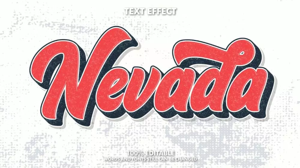
Image source: Freepik
While seeking to design web pages with artistic text, designers must pay attention to ensure that the typography is readable, legible and consistent throughout the page.
Want to learn more about Typography? Check out Jennifer Farley’s first and second articles about typographic readability and legibility.
Micro-interactions
When you visit a website, you may notice certain smooth and subtle movements. These interactions are known as micro-interactions, and they’re intended to give a fun user experience. These subtle interactions come in form of of animated effects, notification pop-ups, floating items, carousels, and so on.
Whether it’s an animated button, or the toggle animation like the one shown below, all of these micro-interactions are web design elements that respond to user activities, provide visual feedback, guide users, and enhance user experience on the website.
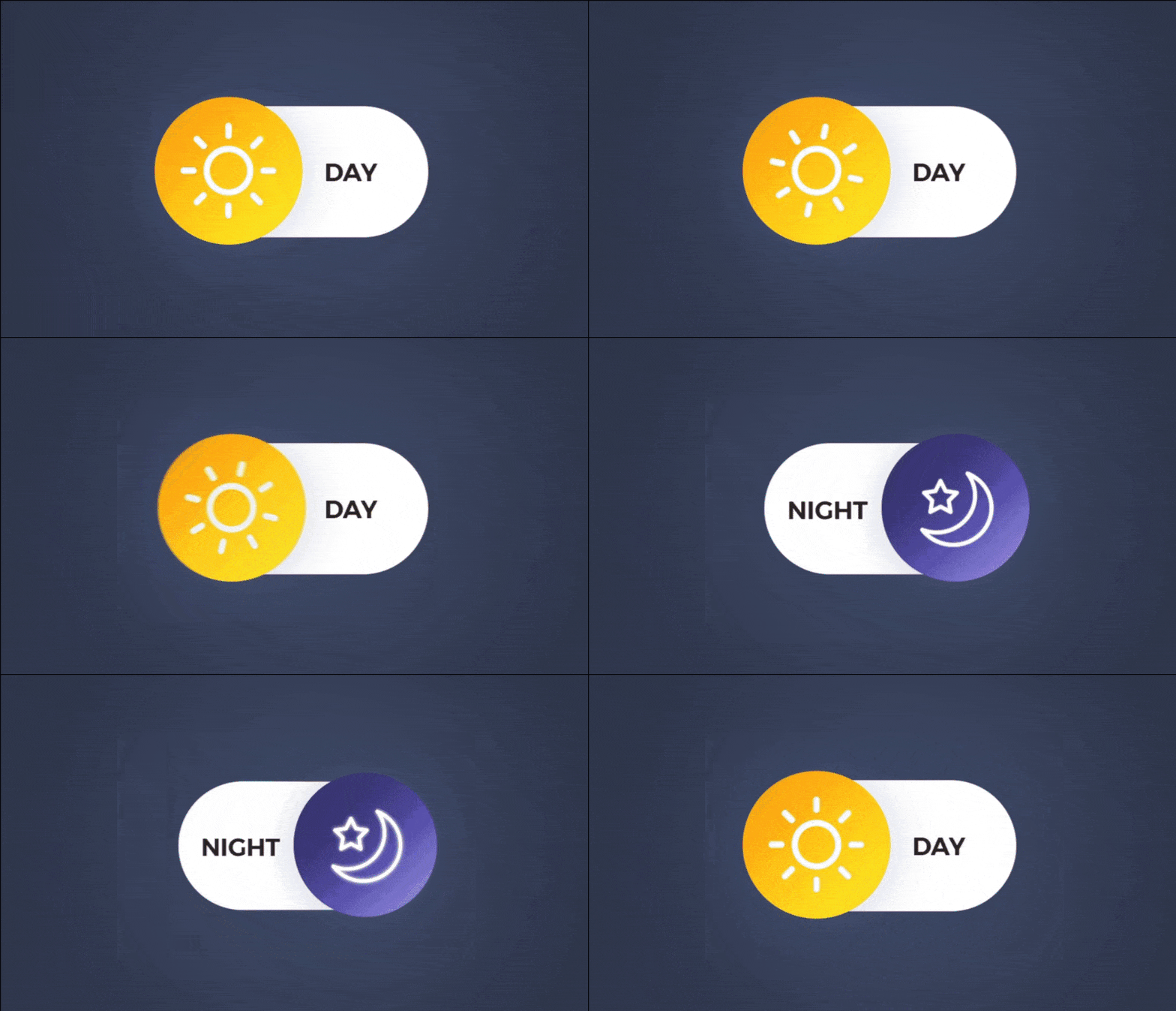
Image source: Koru UX design, Dribbble
Web designers use micro-interactions to create a more engaging and enjoyable browsing experience.
Take the new delete animation in the Telegram mobile app, for example. When users delete a message, a shimmering effect animation displays before the message is removed from view. In my opinion, that’s a good use of micro-interaction (making deleting stuff fun 😉).
Micro-interactions are made up of four parts: trigger, rule, feedback, and loops/modes, all of which web designers must take note of when implementing micro-interactions in website designs.
Brutalism
Maybe you’re overwhelmed by all the new design trends and just wish you could do something simpler? Maybe the “brutalist” trend is more up your alley.
The brutalist movement in web design — inspired by brutalism in other fields such as architecture — takes simplicity and functionality to its limits, essentially focusing on content and the minimal HTML and CSS needed to make it as accessible and usable as possible.
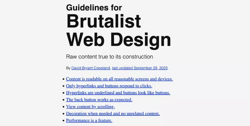
Brutalism introduces many radical — some would say fanciful — concepts into web design, such as making content readable and accessible on all devices, only letting hyperlinks and buttons respond to clicks, the back button working as expected, and so on. If you’re into radical counterculture, check out these guidelines for
brutalist web design.
Conclusion
Scrolling through a website like MA True Cannabis, you’ll discover a variety of web design trends such as micro-interactions, artistic typography, neumorphic designs, and images.
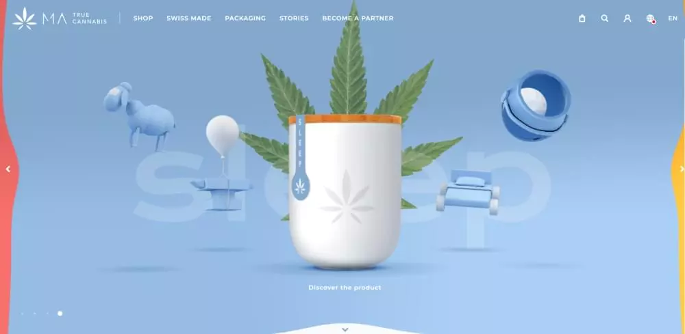
Web designers can artistically combine some of these web trends to create a modern and innovative web experience, but they must be careful not to overdo them in order to design visually appealing, interactive, and functional design. In essence, they must learn to strike a balance between using these trends and not overusing them.
Web designers must carry out proper research, experiment and be creative in order to create truly captivating and functional designs for the Web.
![150+ Top Web Design Companies [May 2024] 150+ Top Web Design Companies [May 2024]](https://europeantech.news/wp-content/uploads/2024/05/mad_reports_6613e88786ba41712580743-390x220.png)
